Thousands of new games get released on the mobile market each day, along with an equal number of creatives. However, users have only three seconds to decide if they're going to continue watching your ad or skip it. That's why developers are regularly faced with the question of how to attract players to their project. Each new idea has to be more inventive and creative than the last, as the audience wants better ads, and new competitors appear constantly.
In this article, we'll share our tips, top methods, and a checklist for developing eye-catching creatives.
First, let's review the definition of ad creatives. They're clips with mini-stories which have to catch future players' attention in mere seconds. They're developed by the creative managers from our marketing department. The department also designs the game's store pages, as well as creating concepts for banners and interactive game ads.
To give it a more technical definition, an ad creative is an original approach in establishing effective communication between the developer and consumer, which takes into account the psychological characteristics, personal values and attitudes of the target audience. In our daily work, we refer to all types of media as creatives, not just videos: statics, playables, and texts that are sent to the advertising network.
Goals and types of ad creatives

Any creative must have certain goals. The first is to attract as many users to your game as possible. The second is to increase brand awareness, which should also lead players to download your game. Each creative must encourage the consumer to install your title in one way or another.
What types of creatives are there? We divide them into static banners, playables, and video ads.

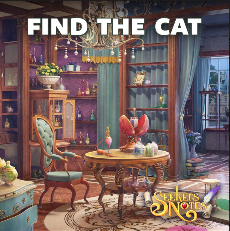
If banners are more or less straightforward, video creatives can greatly vary in concept and implementation. Most often they're short and showcase some feature of the project, or tell a story.
For example, both of these clips made by our creative team demonstrate quite a unique approach:
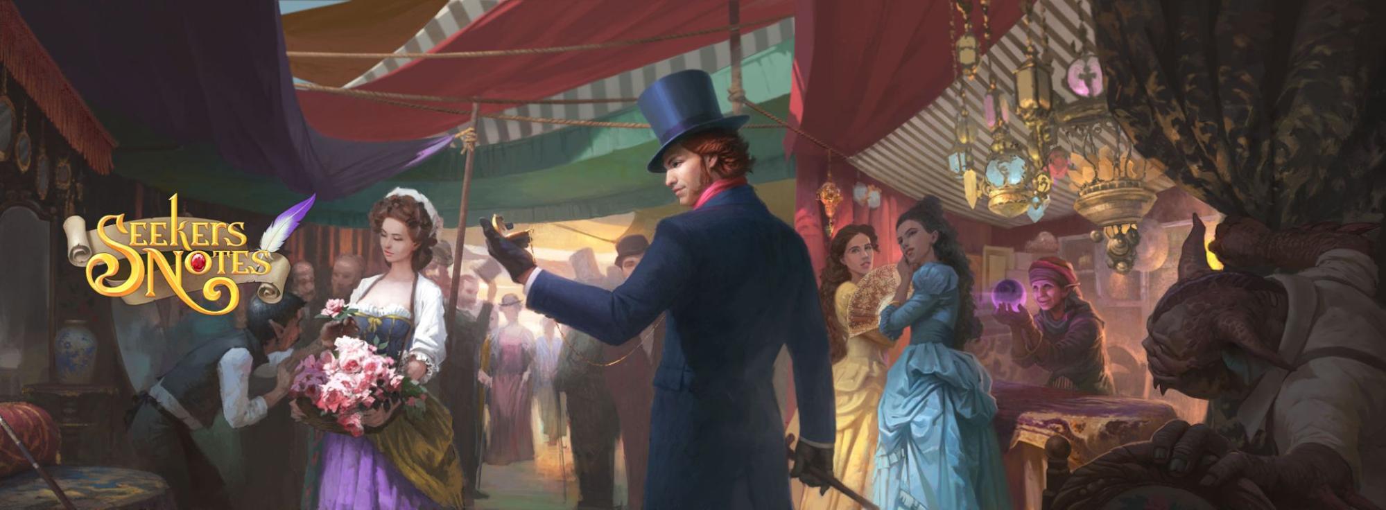
The creative for our hidden object project Seekers Notes is made in a complicated 3D cinematic clip format, and the video for our culinary hit Cooking Diary has a sophisticated story more like that of an animated movie.
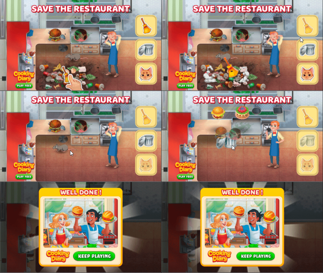
There are also playables (interactive ads) — creatives which you can play and thus experience the main mechanics of the game. If a user likes the gameplay, they're more likely to follow the link and download the game.
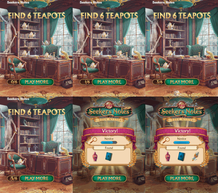
Mayor Teapots — one of the first playable creatives in our company. The mechanic itself is misleading for the project, since there's no mode for finding identical objects in the game. Before, the creatives only used the main hidden object mechanic. But this creative immediately rose to the top of ad campaigns on all networks, and despite its numerous iterations, didn't lose its position. Perhaps it's due to the bright Mayor's Office location, contrasting white teapots, or the easy difficulty level suitable for our target audience.
Where to start making a creative 5 important pre-production steps
Our experience shows that thorough preparation and analysis are required before starting to develop a creative. The better the pre-production, the stronger the creative will be in the end.
Start by studying your game with the aim of marketing it and presenting it to your audience in a favorable light. What is needed for this?
Identify and segment your target audience
It's really important to know and identify who you are making a game for. Let's say you've determined that your target audience is women between 18 and 70 years old. For your project to be successful, you need to segment them by age and preference.
Identify the needs of your target audience. What do they want? What are their preferences? After all, they will be different for a 20-year-old and a 65-year-old woman.
Next, you need to proceed to segmentation—dividing the audience into several similar groups. You can divide them by age, country, or interest. You need to look at and analyze exactly that group of women that would be of interest to you as regular players. For example, whether we need businesswomen or housewives, whether they are mothers, etc.

Work out where you can find your audience. What websites do they visit? Where are they located? Make a list of potential advertising websites.
You also need to juxtapose your strengths with the interests of your audience—what you're going to attract them with. And the resulting list of characteristics can be used when making your next creatives.
It's important to watch lots of ads. You need to take a closer look at the ad creatives you come across on the internet and analyze them, what attracted you to them. After all, one way or another, you too are someone's target audience.
Identify your project's main asset
The next step is to find out what is good about your game, what its main feature and mechanics are, what makes it unique. You have to find a feature of your game that the audience will love, and convert it. There might be several of them, so to decide on the main one, you can test different creatives, highlight one asset in each and compare their performance.
List the benefits to the target audience
By installing your game, players should somehow benefit from it. The benefit is not necessarily the possession of your game, it may be various emotional characteristics. For example, games are now like antidepressants for many people—they help them to relax after a hard day's work, and also distract from bad thoughts during this pandemic.
Think about how your game will be used
This point can be interpreted in different ways. For example, Seekers Notes for some of our players is not just a hidden object game, it serves as an excellent memory and attention stimulator, as well as helping to overcome difficult emotional situations.
The players of our time management game Cooking Diary say that our game helps them train their attention and teaches multitasking, as well as inspiring them to cook unusual dishes. For many players, it also helps relieve stress after a day at work.

Highlight the competitive advantages of your project
Find out what projects your game will be on the same shelf with, what makes your game stand out from competitors, and what it may lack.
Research your competitive niche:
What kind of creatives do they use to promote their games?
Where do they advertise?
How do they attract attention?
How do they position themselves?
Try to determine the marketing strategy of your competitors. Draw up a document listing your competitors and see who is the strongest and who is the least strong.
Let us share with you some helpful tools for studying your competitors:
You can use these tools to take a peek into the world of your competitors and gather the data you need, to get inspired and to find something interesting for yourself.
Things you need to consider when developing a creative concept: 5 effective principles

There's a lot of advertising these days, and there's even a concept known as "banner blindness." This is when we see an ad, but don't really pay attention to it, even though it might suit our needs at that moment. So, for any creative manager, it is important to hold the viewer's attention. The basic principle of any creative asset is attention and its retention.
1. The first 3 seconds of a creative asset are the most important
In the first three seconds of your creative asset, you should try to fit everything that intrigues and interests, everything that grabs your customer's attention. The climax should be placed at the beginning. Imagine yourself in the place of the user, scrolling through their Instagram or Facebook feed. Your ad should grab their attention in an instant.
2. To be understood, keep your message simple
You don't have to put all the ideas into your creative asset or try to show all the advantages of the game. Doing so will make it very difficult to hold the viewer's attention.
3. Direct the viewer's attention
When you create a banner, you have to place emphasis in such a way that users pay attention to the part you want immediately. Users tend to look for faces in images—this is the first thing they subconsciously pay attention to. Therefore, you should not put your game logo in the opposite corner from a character—there's a possibility that it will simply not be noticed. This rule also applies to the CTA button: if you want it to be noticeable, put it next to the character.
4. Remember the path your users go through
You have to keep in mind the goal of your creative, what result you want to achieve—to make the viewer install your game or buy an in-game item?
After viewing your creative, your potential player goes to your game's page in the app store. And it is very important to make sure the link fits with the creative, as the viewer may be disappointed if the game page doesn't correspond to the ad they just saw.
5. Add a specific call to action
The viewer should understand what you want from them. Display a "Download the game" button and a "Play now" button to make them install the game. This also works on a psychological level.
6 creative approaches when you run out of ideas

There are so-called creative approaches that we use in our work.
We have made a selection of our videos with examples of these approaches.
1. Challenge
The idea of this approach is that you challenge the player on something that would be interesting to watch and they would like to repeat in the game. For example, in this video, you need to find 24 items in 15 seconds. We put a girl here to make the challenge a bit more emotional.
We try to attract the viewer with gripping and dynamic gameplay. And at the end, we call them to action: "Want to try again?"
2. Before/after
This is the before and after video—how things change from bad to better. People enjoy seeing changes.
3. FAIL
Analysis of the mobile game ad market shows that a fail in a creative video works better than a happy ending. Subconsciously, the viewer wants to try the game and do a better job.
4. Contrasting
In this approach, we compare characters and contrast them with each other. It is always interesting to see what happens to characters put in the same situation. In our video, we contrasted the main character with her boyfriend's ex.
5. Emotions
Demonstrating strong emotion at the beginning of a video ad can have a significant impact on its performance. As a rule, negative emotions work even better than positive ones. This is a before and after video, too: how "before" everything was bad and how, when Dave is there, everything is awesome.
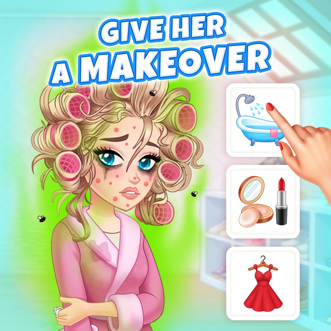
6. Makeover
Video ads with this approach are at the peak of their popularity now, but they have always been widespread since the days of various TV makeover shows.
In this video, we showed a complete ugly betty and turned her into a beauty. But we decided not to follow the stereotype that being skinny is beautiful—we didn't change her body size.
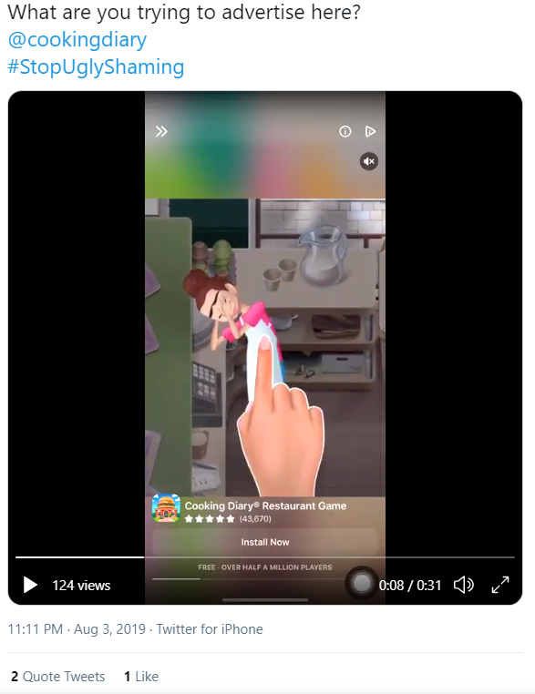
We had a funny case regarding a creative for Cooking Diary—Shock Ugly Chef. It was a makeover video. This creative asset caused quite a stir within the Cooking Diary community and beyond.
We came up with Ugly Chef at the end of June 2019. Back then, it was a regular Cinderella thing—customizing this character would bring players aesthetic pleasure. The concept was polished and submitted for an ad campaign a month later to take on the US market.
Almost immediately after the launch, the social networks exploded with rage, there were lots of reposts, and at the same time we had joyful reports from UA team about the success of the launch. Thus began the Ugly Chef era, with different concepts.
At the same time, we kept searching for other characters. So, last year, it was the charismatic Dave who found his way into the hearts of our target audience. In the game, he was a cute delivery man, while in our creatives he was also a handsome surfer and a movie star. To boost the effectiveness of our creatives, we integrated Dave into the screenshots for the app store. Later, his in-game skin was changed to a more athletic one.
Ugly Chef gave us a huge base of cool creative assets and is still one of our favorites.
How to develop a creative concept: 3 tips to keep in mind

1. Stay focused on the expected result
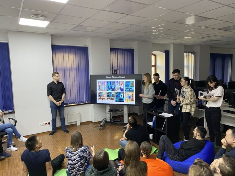
When developing a concept, you should have an idea of the final result, what you want to get in the end. If the idea in your head does not add up, you will not get quite what you expected. That's why you should think through your concept frame by frame from start to finish, including all the small details.
2. The terms of reference must be simple and clear
A creative concept is more terms of reference than a literary work. Be specific and avoid vague, descriptive language.
3. Collect and compile references for anything that is hard to explain in words
References are needed so that you can imagine characters, locations, scenes, transitions, animations, music, etc. These can be various images, your competitors' creatives, or the artworks of other artists.
So, these tips should help you make an effective creative asset. When the creative asset is ready, we submit it for testing and wait for the results.
Basic analysis of the effectiveness of creative assets. What do the numbers tell us?
What do you do when you finally get the results? In front of us, we see a load of numbers that we need to get to grips with.
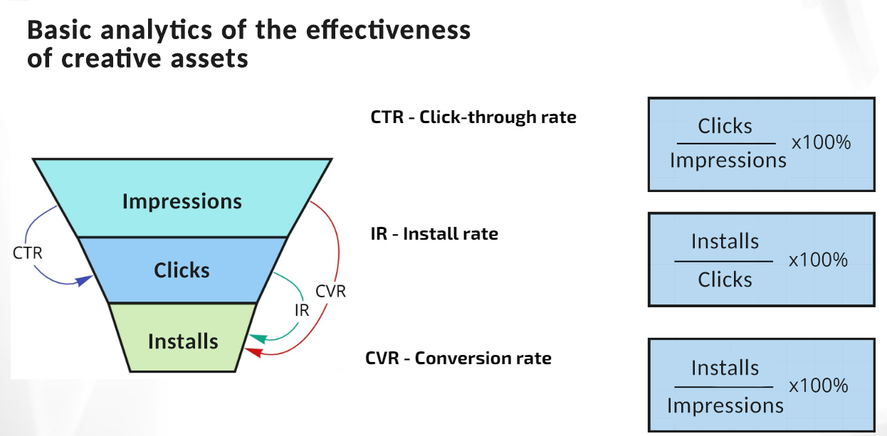
You get a huge amount of data per creative, but the key points are: the number of clicks, the number of impressions and installations.
The main creative KPIs for basic analytics are:
Click-through rate (CTR) is the ratio of users who were interested by your creative asset and followed the link. Video creatives are rarely watched through to the end, so if the CTR is high, you can conclude that perhaps the CTA or the first frames of the creative worked well.
Install rate shows the ratio of installs to clicks, i.e. how many people installed the game after clicking the ad. The higher the IR, the more the page content meets the player's expectations after viewing the ad.
Conversion rate (CVR) is directly proportional to the metrics mentioned above. Conversion can vary depending on the goal of your ad campaign. For basic analysis, we take the CVR as the ratio of impressions to game installs. This metric shows how good your creative asset is overall.
Thank you all for reading the article to the end! We hope it was interesting and helpful. Making creatives is an art that needs to be constantly studied and mastered. Wishing you all success and awesome creative assets!
