Our new article is now live on render.ru, the largest information resource on computer graphics. We are happy to share it with you!
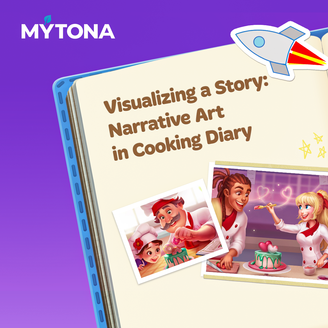
In our latest article, we shared a case study of how we create dish artwork for our culinary bestseller Cooking Diary. Today we want to show and tell you how we develop narrative illustrations for this project. We'll go through the process, from sketching to rendering, using one narrative illustration as an example.
Games in the time management genre don't usually emphasize story. But lately there's been a new trend: culinary games now often feature a plot. In our game Cooking Diary, the plot is a great tool that improves player retention. It's distinguished by simple delivery, intriguing storytelling, and a sparkling sense of humor. Quite a lot of players beat level after level not only to unlock new restaurants, but also to see what happens in the story. The plot helps players get deeply immersed in the game world. Players feel like they're directly involved in everything that happens in Tasty Hills, and their goals have more meaningful motivation behind them. At the same time, storyline elements provide an opportunity to relax between stressful levels.
The story begins when the player receives a letter from their grandfather asking them to return to their hometown and continue the family business by becoming the owner of a restaurant chain. On this difficult yet exciting journey, the player will meet different characters, each with their own unique personality and goals. It's up to the player to uncover all the plot twists and write their name in the culinary history of Tasty Hills!
Let's move on to the topic of narrative art. What exactly are narrative illustrations? Simply put, a narrative illustration is an image with a cohesive composition. The background, color, lighting, and all elements of the artwork work towards the perception of the illustration, composition, and idea as a whole. Everything is important in an illustration: the placement of objects, details, color and light accents. All together, they should visually tell us the story.
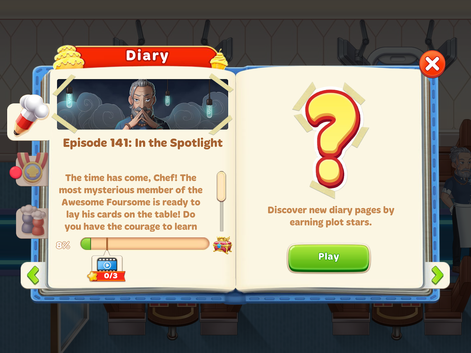
Types of narrative artwork: Titles, flashbacks, diary artwork
We use three types of narrative artwork to tell the story in Cooking Diary: titles, flashbacks, and diary artwork.
Titles: the story in the game is divided into episodes, and titles serve as covers for each separate episode.
Flashbacks: all illustrations shown during dialogues are classified as flashbacks.
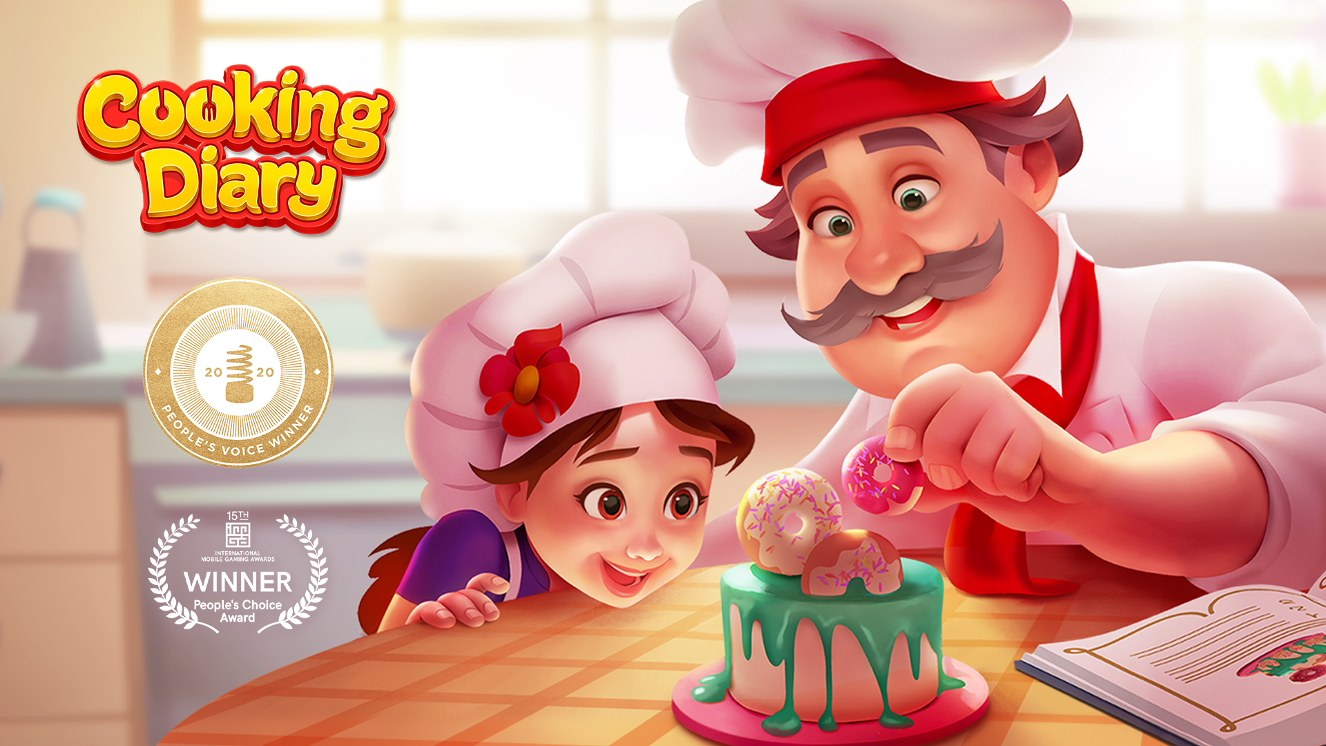
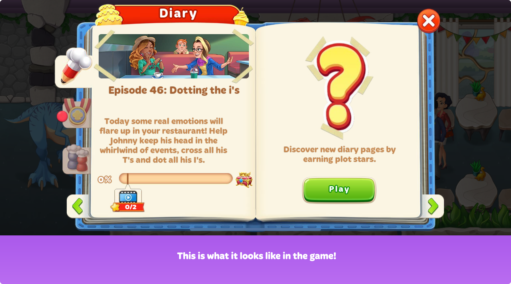
Diary artwork: these are illustrations that appear in the player's diary after each episode. They are stylized as photographs.
In this case study, we decided to share the process of creating a narrative illustration using one title from Cooking Diary as an example.
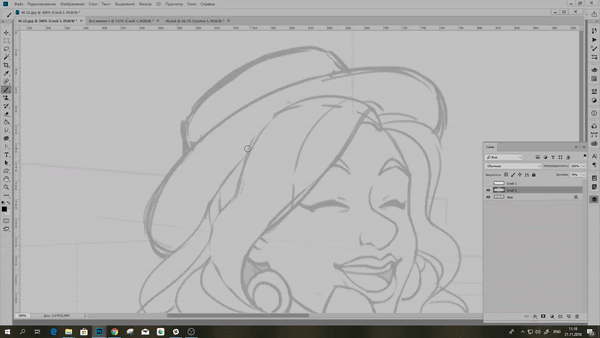
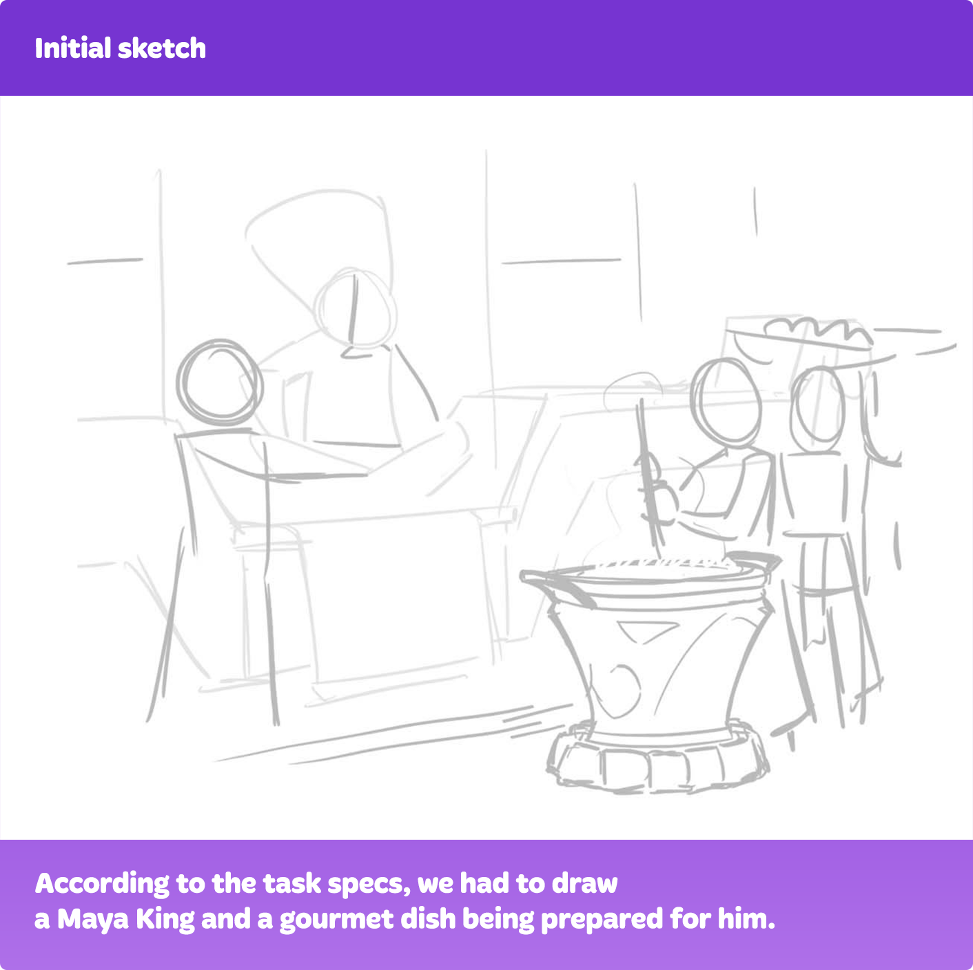
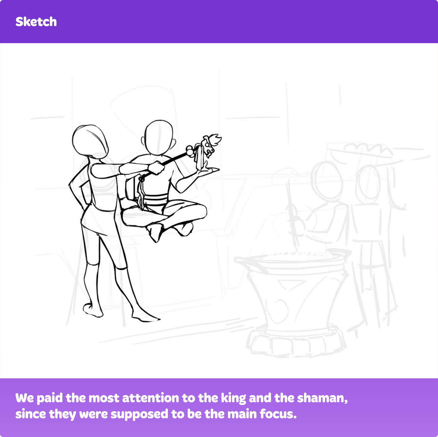
Step 1: Creating an initial sketch
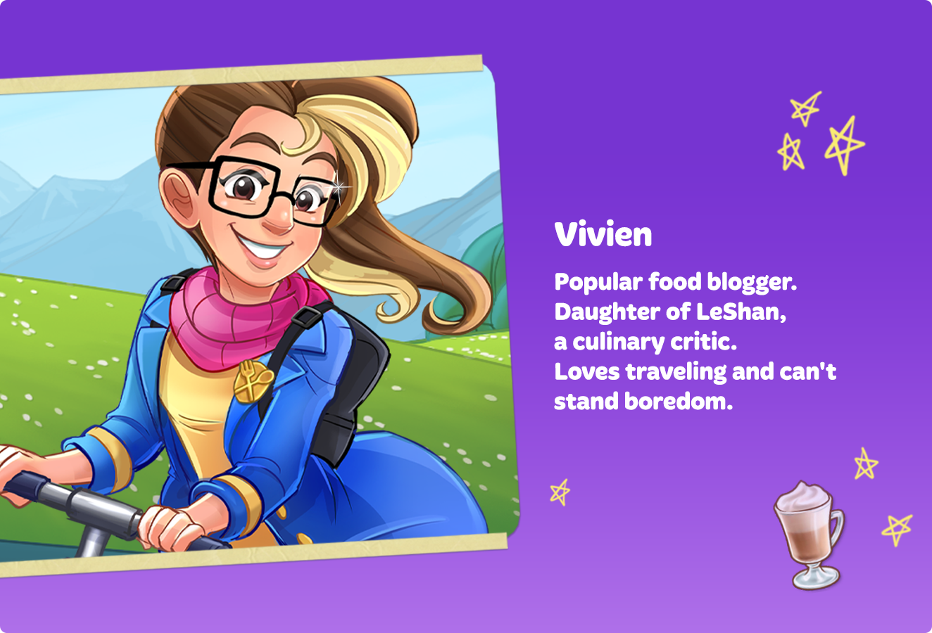
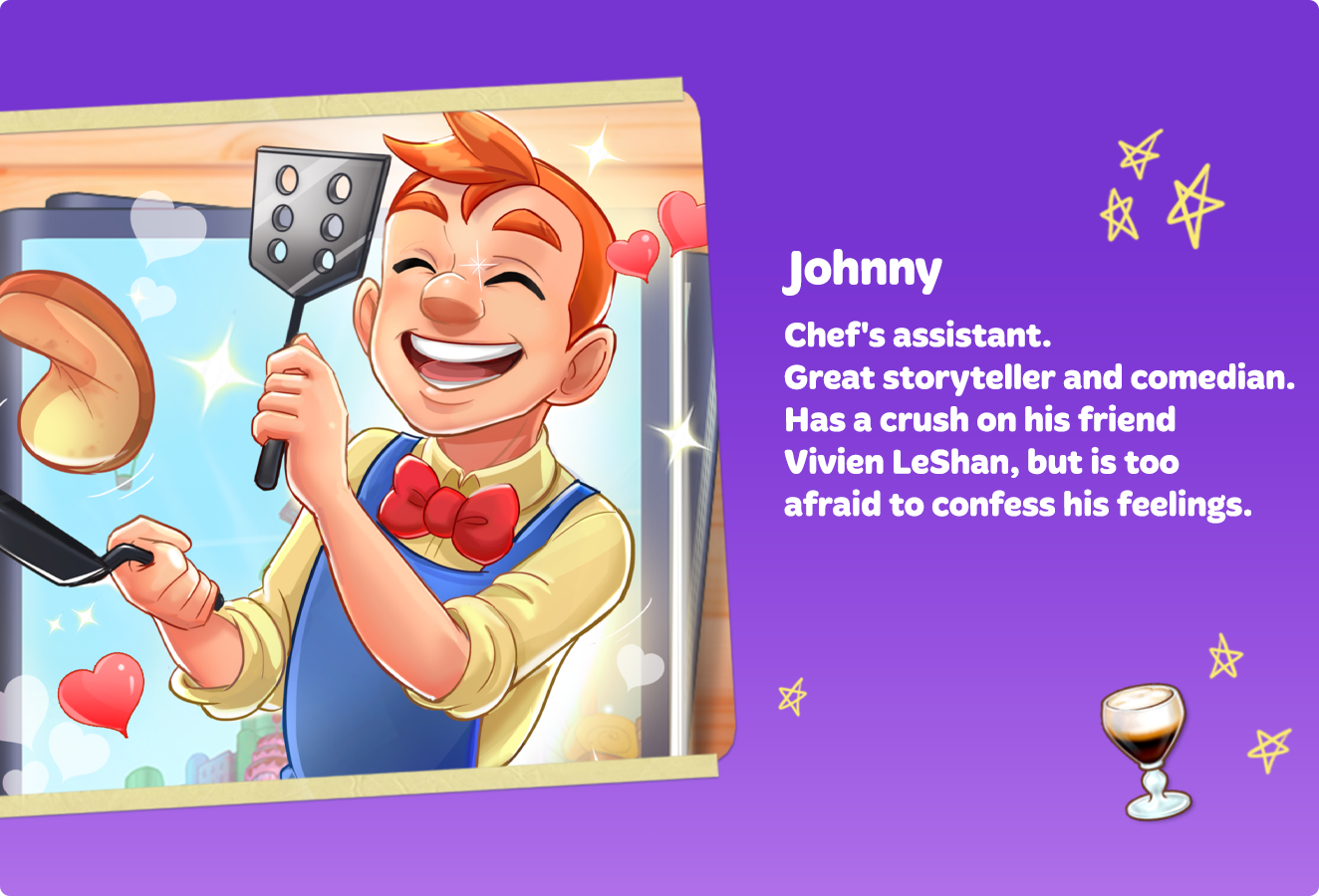
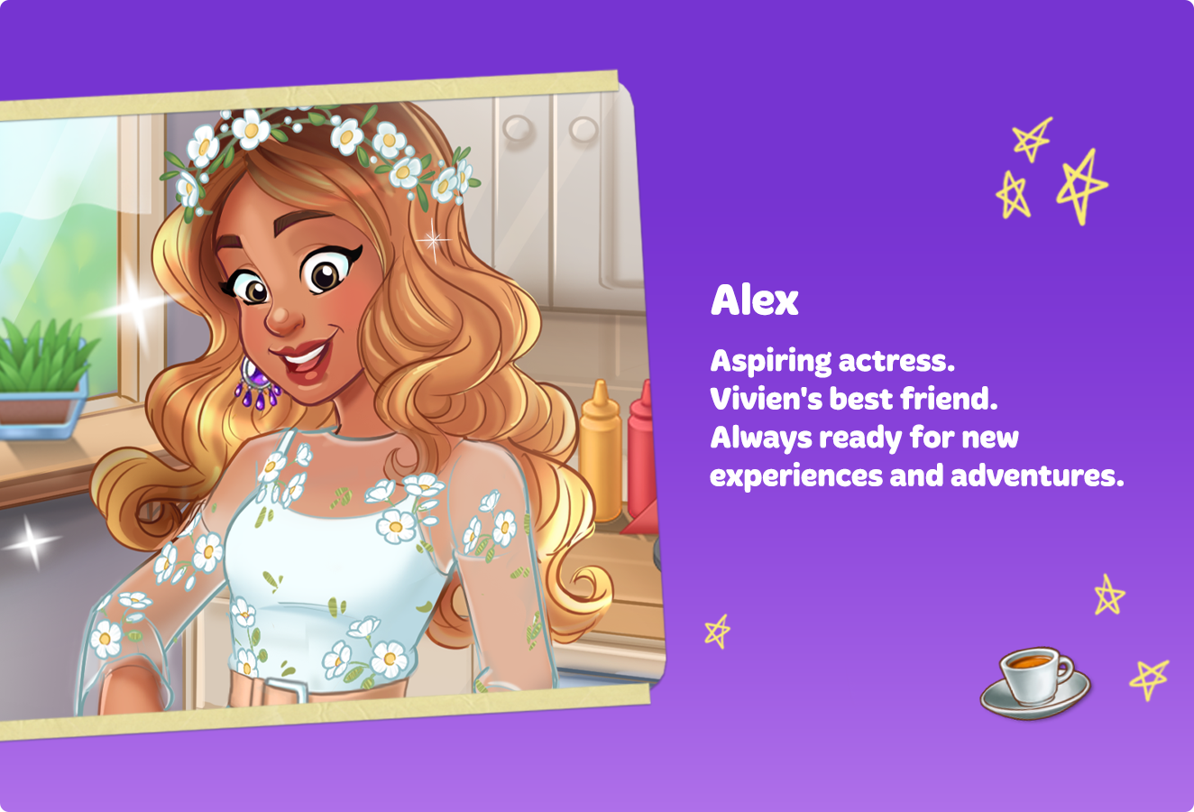
First, let's see what illustration we need. The specs for this task were: “Alex and Vivien are sitting at a table and talking to each other. Johnny stands in the background between them. His head is turned towards Vivien, he's smiling adorably and blushing a little.”
First, let's carefully read the character descriptions in the design document.
So, after reviewing the task specs and reading about the characters, we have to do an initial sketch. This is a quick rough draft that we use to define the composition and proportions. At this stage, the characters' poses and lines of action are decided on. We also have to think about how the characters' emotions will be visually conveyed in the scene.
We begin by creating a composition. To make this task easier, we use this composition grid.
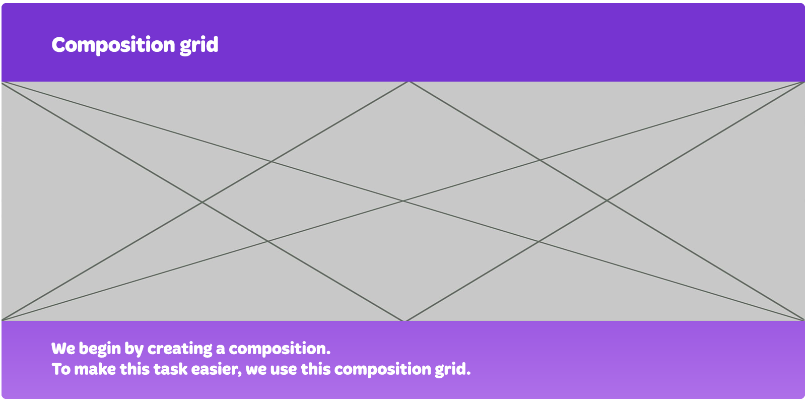
Important elements and focal points should be placed on intersections, and diagonal lines serve as action lines for characters. This way, we get a dynamic yet balanced composition.
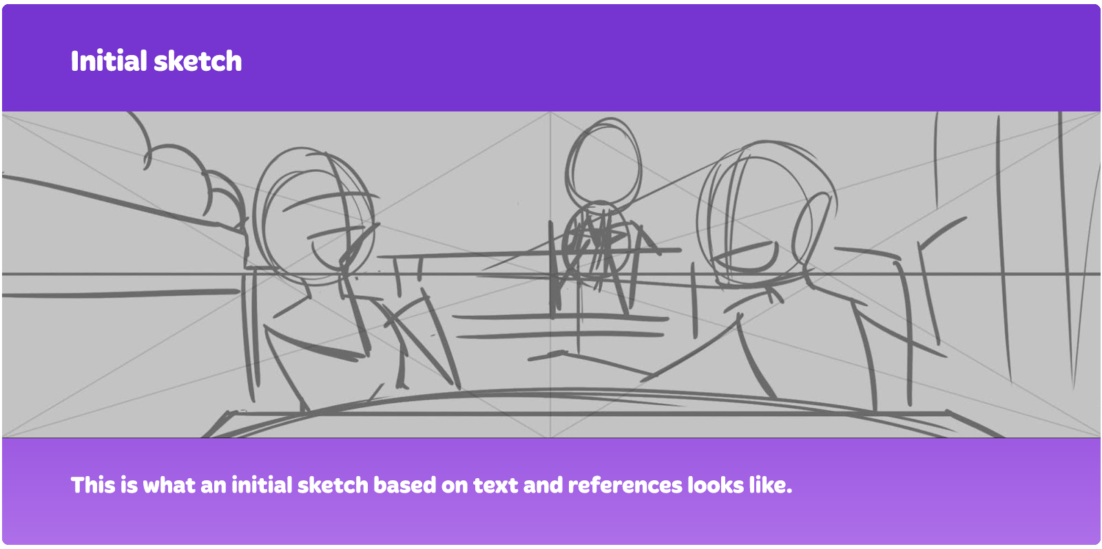
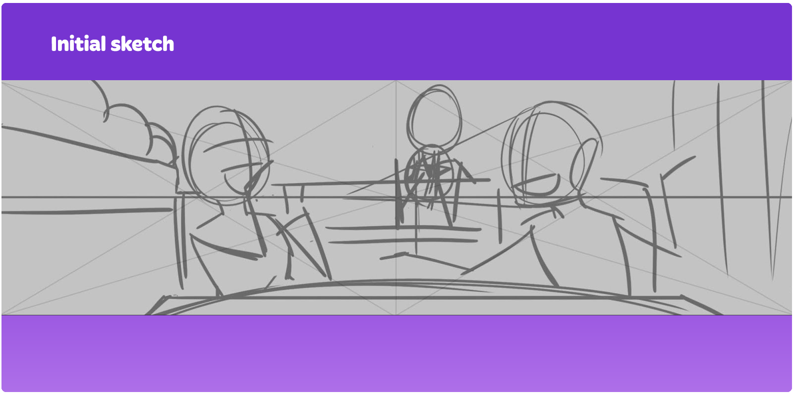
This is what an initial sketch based on text and references looks like.
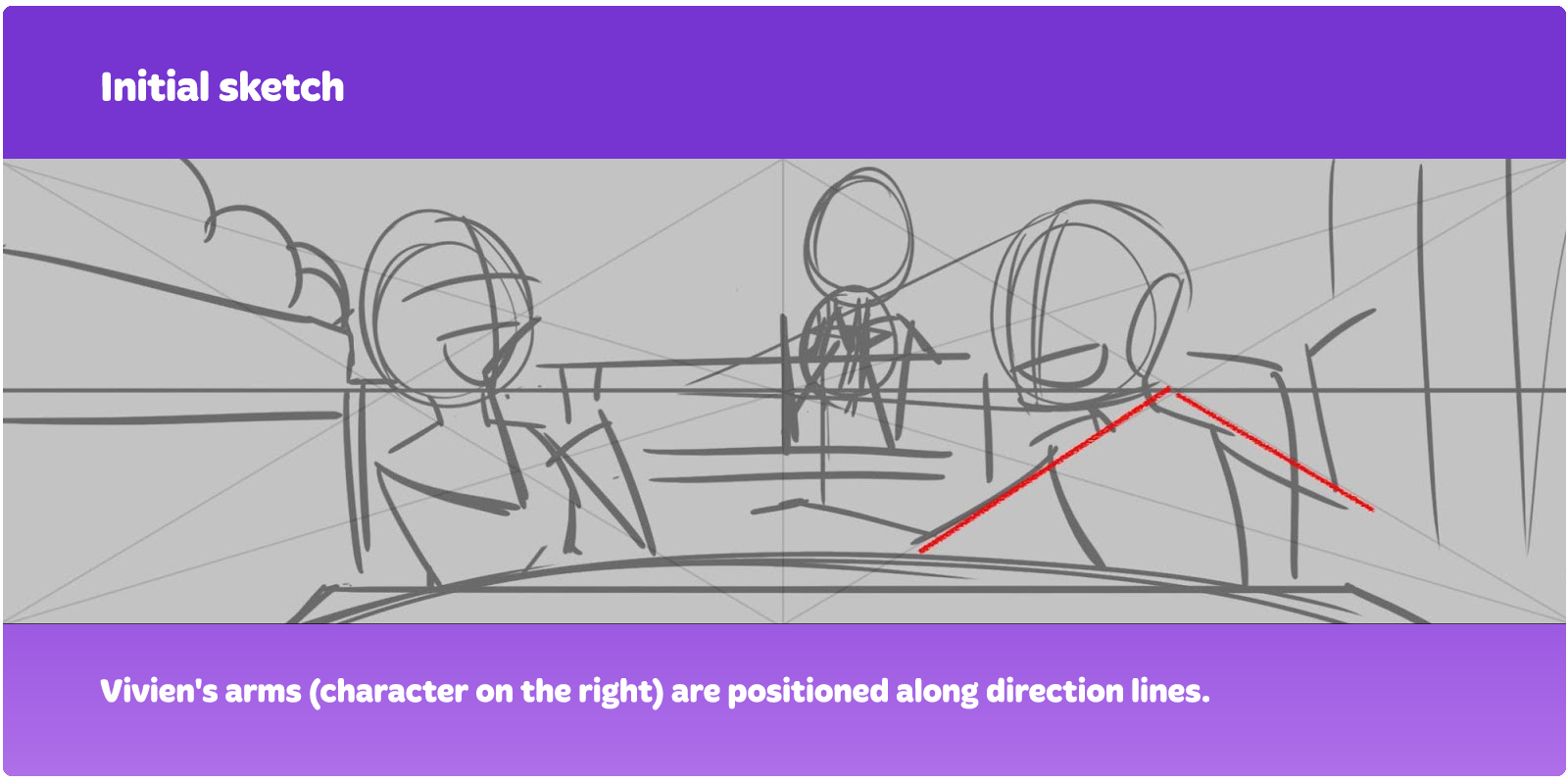
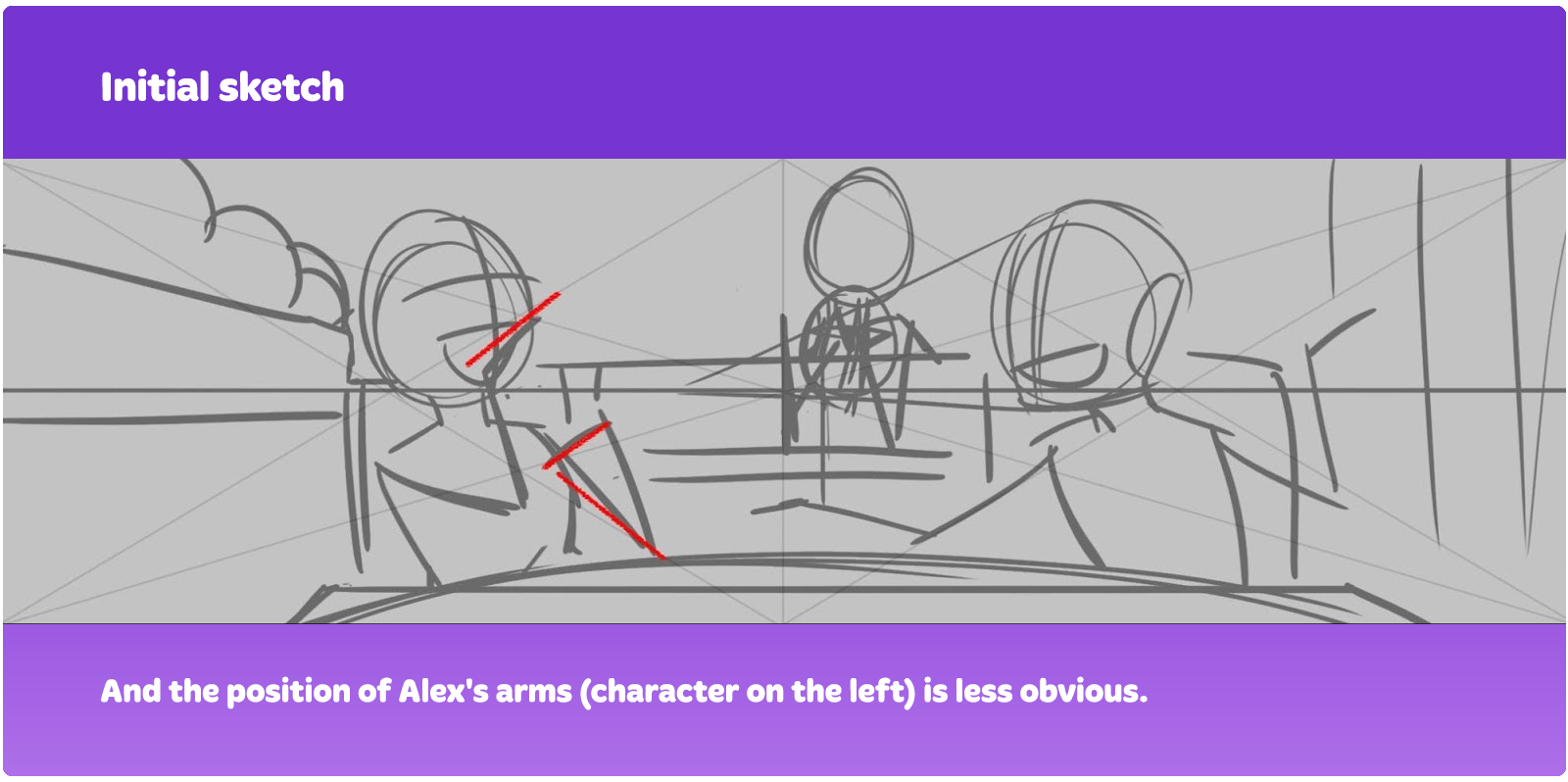
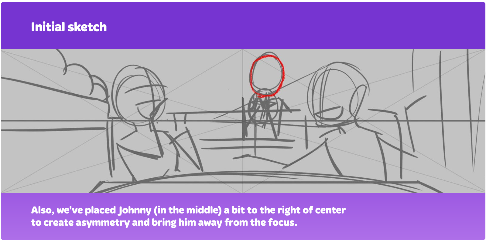
Note that the characters' heads are at intersection points.
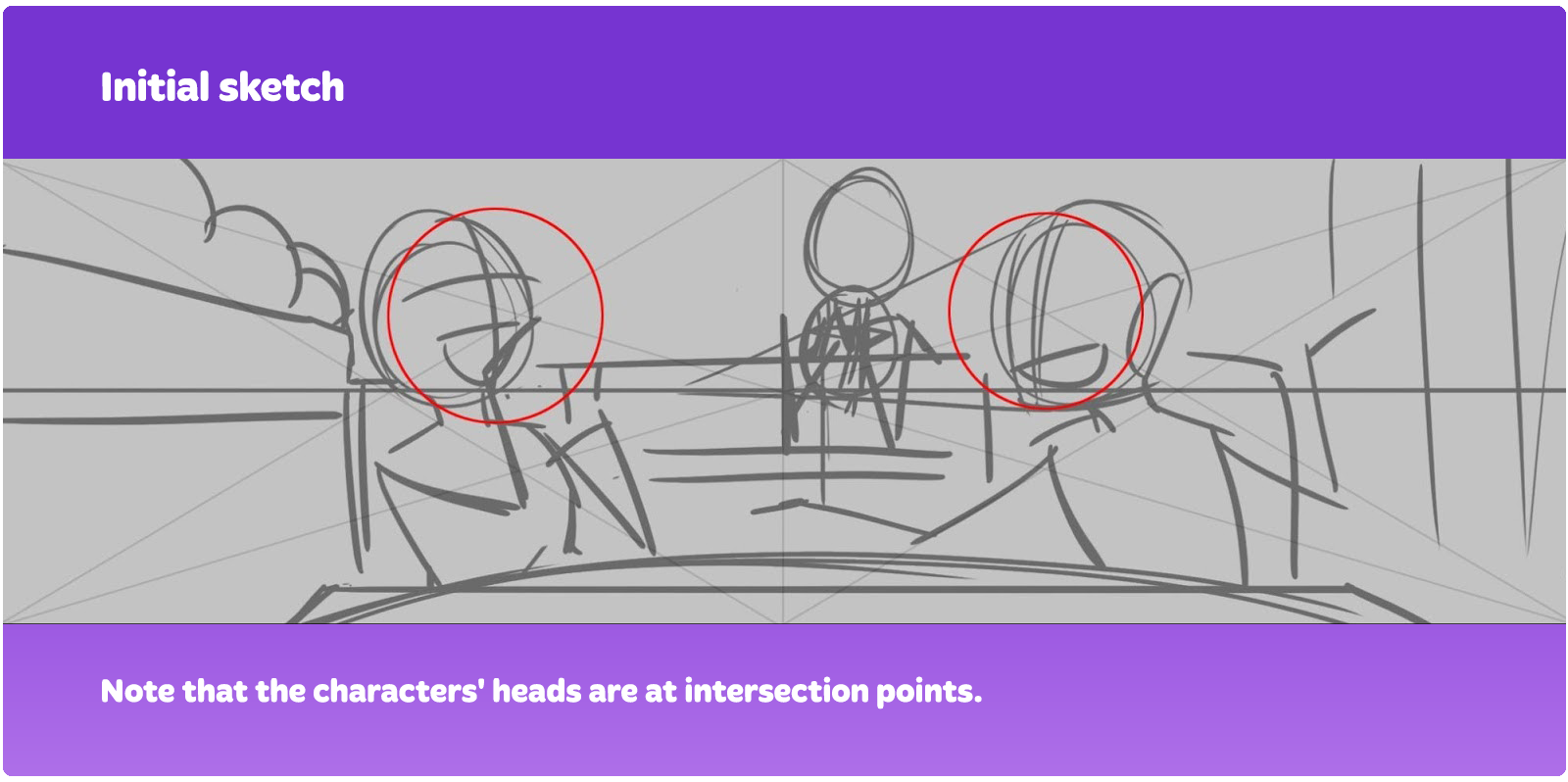
Vivien's arms (character on the right) are positioned along direction lines.
And the position of Alex's arms (character on the left) is less obvious.
Also, we've placed Johnny (in the middle) a bit to the right of center to create asymmetry and bring him away from the focus.
When choosing a pose, we keep these points in mind:
Try to tell the story
Show the character's personality
Show how characters interact
Story: this is the situation the characters are in. They should react to this situation and show their personalities. The unity of these two points will determine how characters are going to interact with each other.
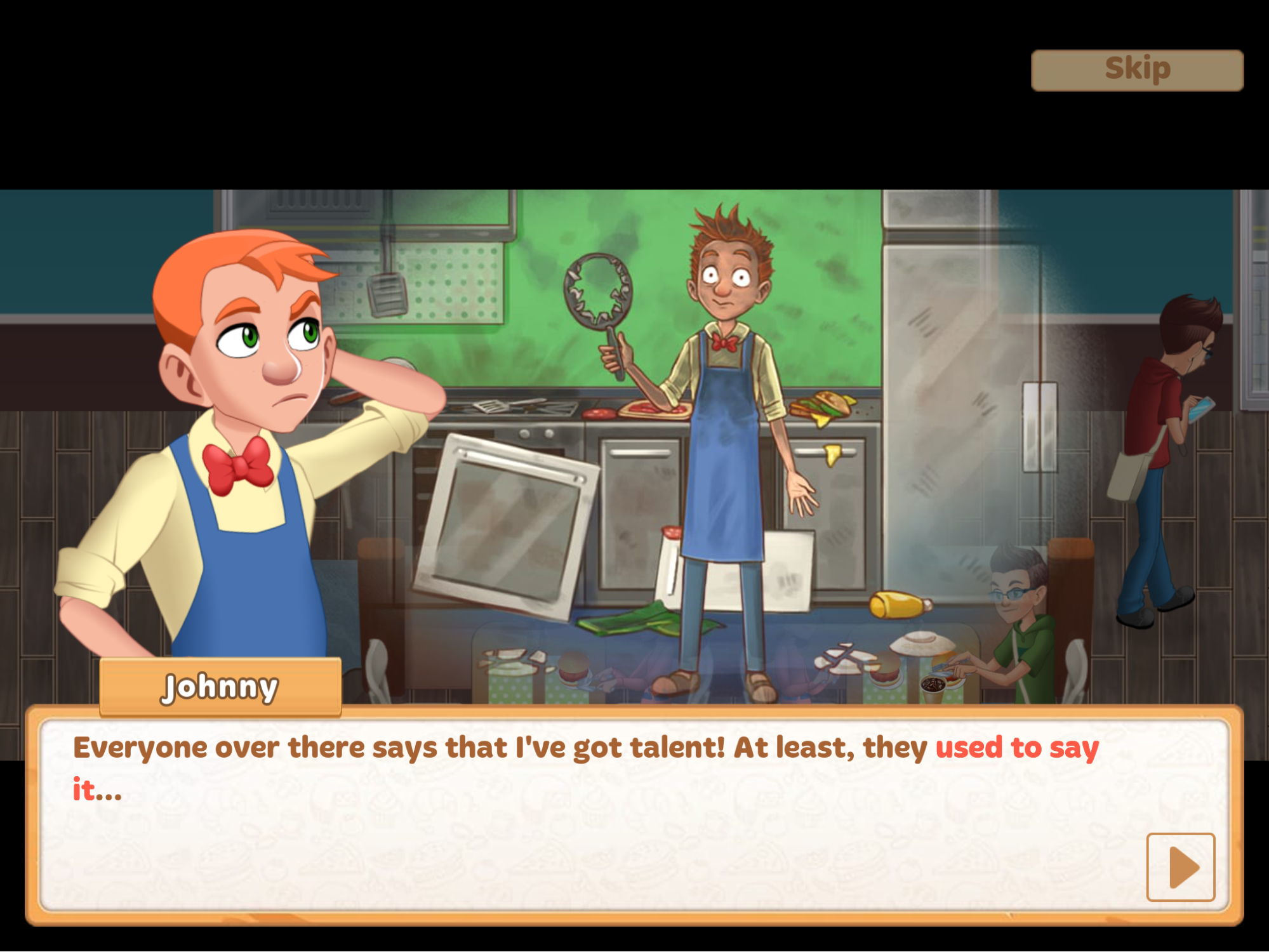
The story in our example is simple: two friends are having a good time at a cafe, while a boy who has a crush on one of the girls is shown in the background.
Vivien (character on the right) is a tomboy, she makes broad gestures, and she's more active. That's why she's tilting a bit more forward and gesturing with her hands—we can show that she's excitedly telling her friend something.
Alex (character on the right) is more graceful, and her gestures are more reserved. In the sketch, we positioned her hand on her chest as if she's saying "I can't believe it!" to show her femininity and surprise. And she's covering her mouth with the other hand.
Their interaction goes like this: Vivien talks, Alex reacts. Johnny is in the background, no one notices him.
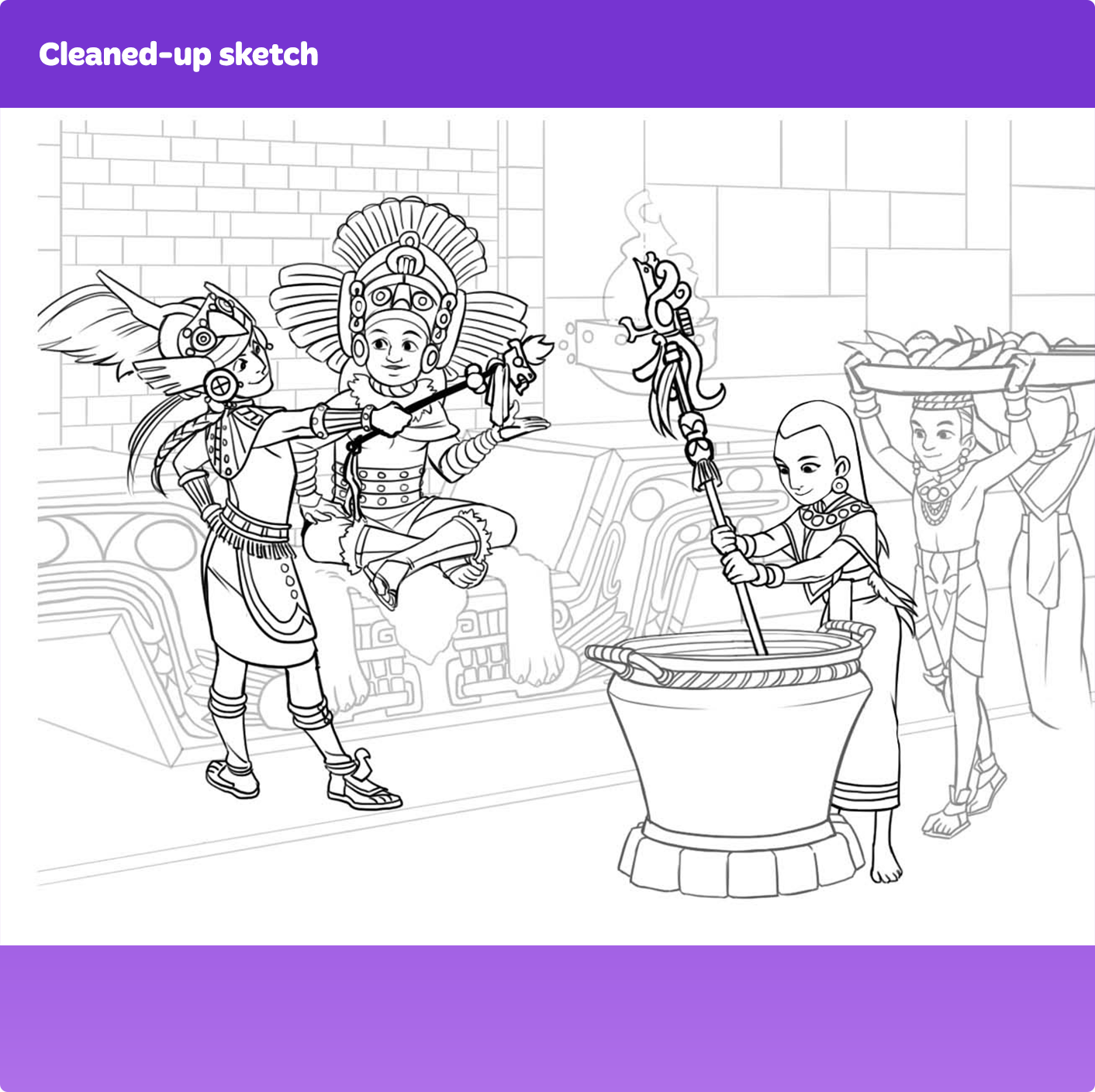
Step 2: Creating a final sketch
After the initial sketch is finished, we move on to creating the final sketch.
At this stage, we clean up the rough draft and make the characters look anatomically correct. We add more details, i.e. hair and clothes, and draw facial features. The placement of objects in the scene may change, which is normal.
For example, here the placement of characters' arms has changed. We moved Vivien's hands to make her pose more readable and open. Alex's hand was obstructing the view of her face too much in the initial sketch, so we had to place it lower.
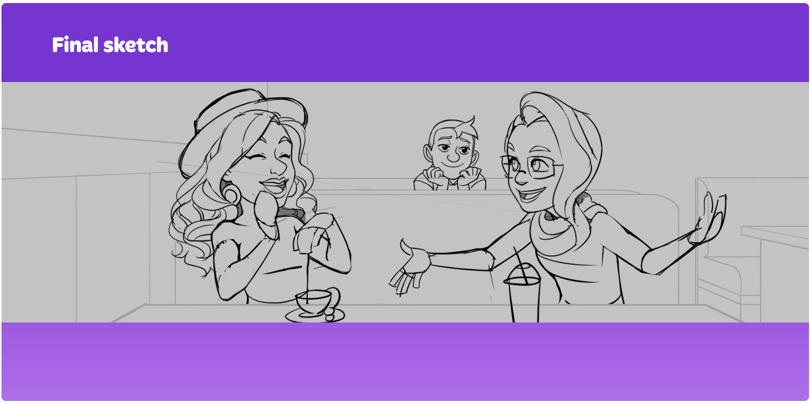
Also, we added detail to the characters' drinks. Vivien has a modern drink—sweet soda. Alex has a more elegant drink—a cup of tea on a saucer.
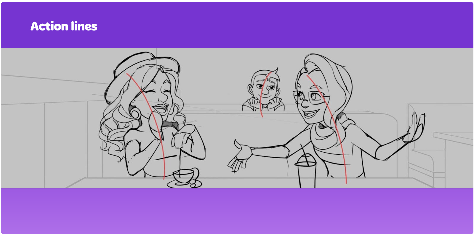
At the sketch stages, we always use action lines. An action line is an imaginary line that a character's action is aligned along. The character's silhouette should follow this line to accurately convey the dynamic and direction of a pose and a gesture. It is advisable to use curves and S-shaped lines, because straight lines will make a pose too stiff.
In this example, note that Johnny's head is turned towards Vivien. Even when only a character's head is visible, using an action line can make it more dynamic. This head turn also shows that Johnny likes Vivien.
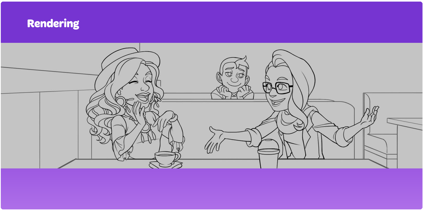
Step 3: Rendering
Linework
After the final sketch is complete, we move on to the final stage—rendering. Most of the work gets done at the sketching stage, and then we do the linework. Smooth lines require quick, sharp movements. Feel free to use an eraser to correct your lines.
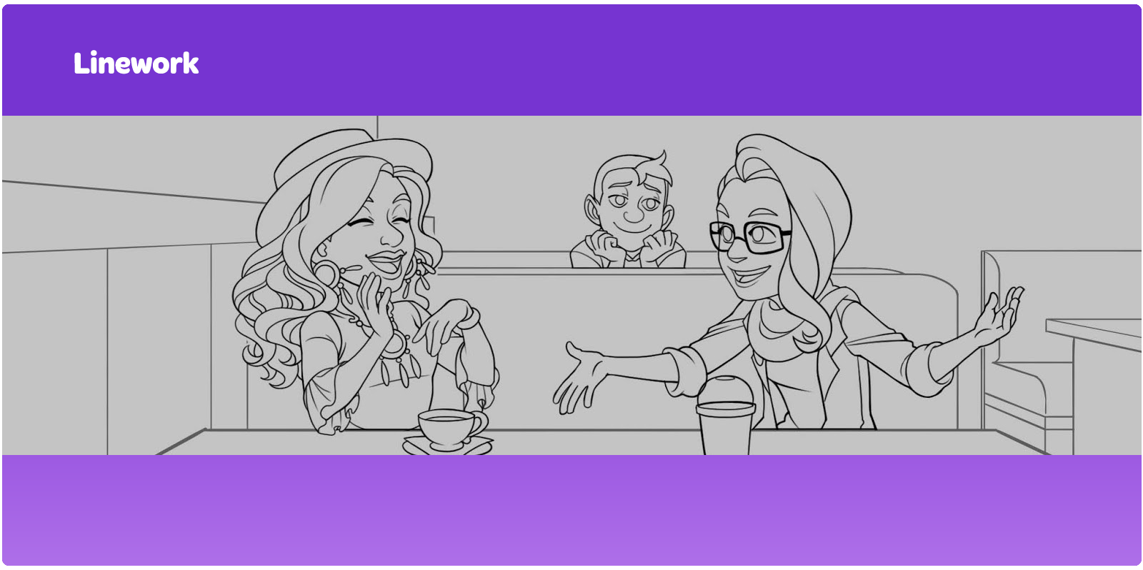
To make long and curvy lines, we use the following trick:
Adding the main color
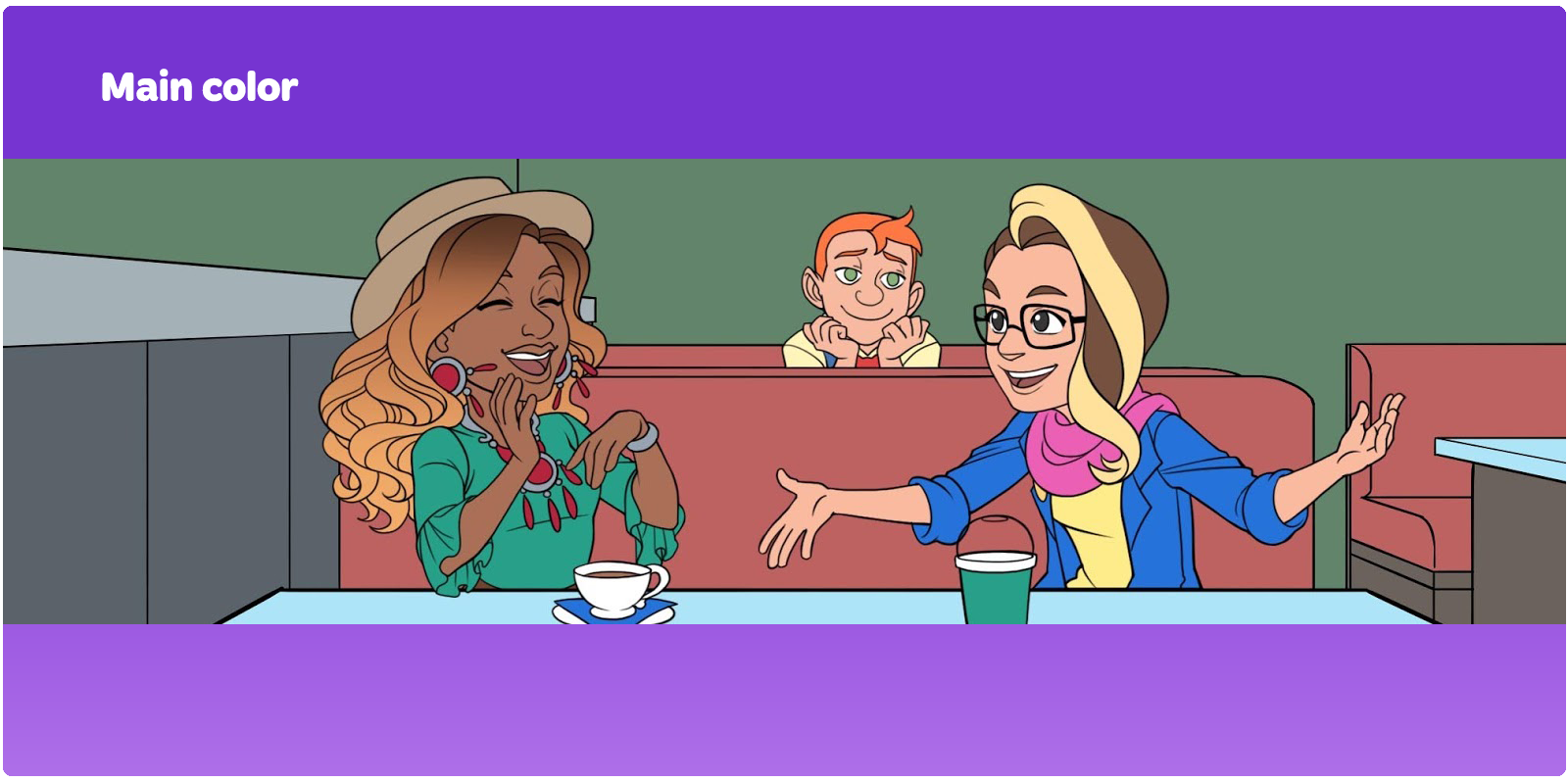
Once we finish the linework, we fill the drawing with the main color.
The main color is the color at medium saturation with no shadows or highlights. In this example, we didn't want to use too many colors, so we used colors similar to the color palette of the characters. The tabletops and the bottom of the wall are shades of blue—like Vivien's jacket. The wall in the background is another shade of green—the color of Alex's dress. The red seats are a warm tone that is between yellow, orange, and brown.
The characters' skin, eyes, mouth, and hair are colored in on separate layers.
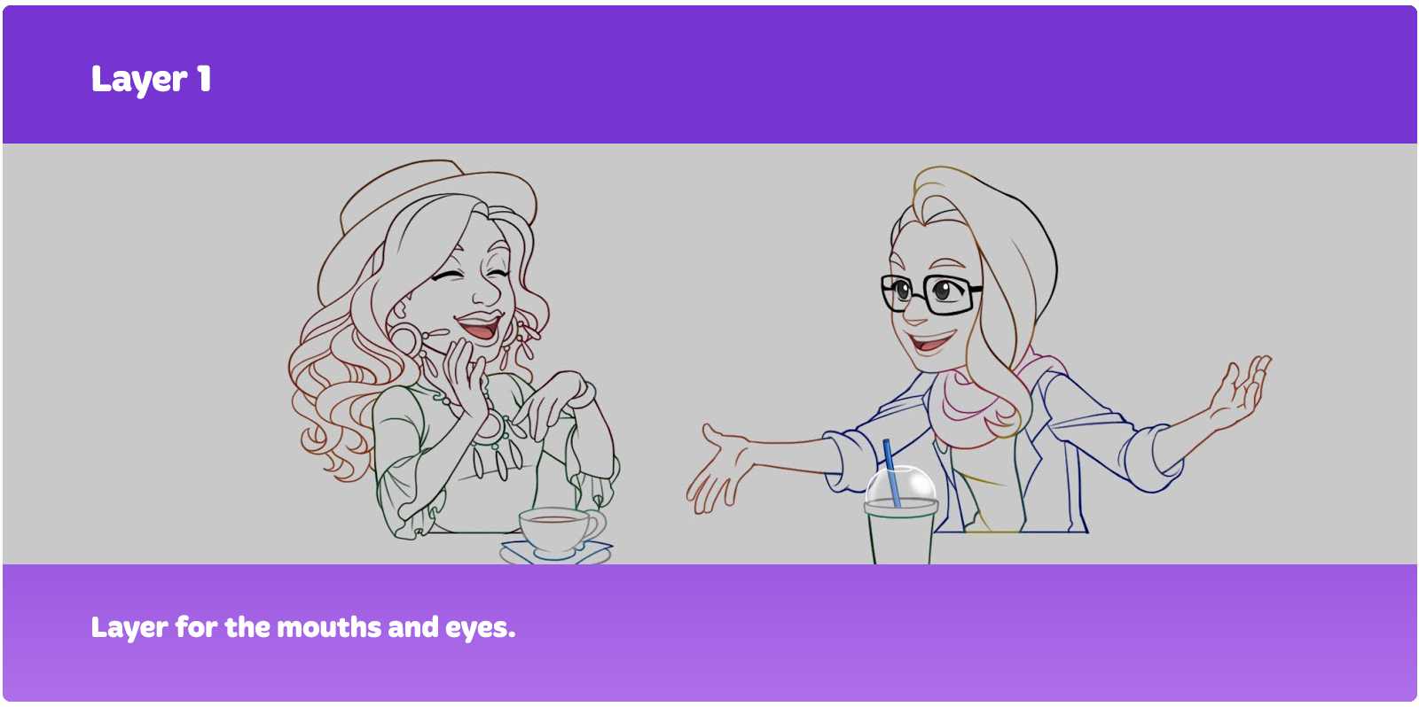
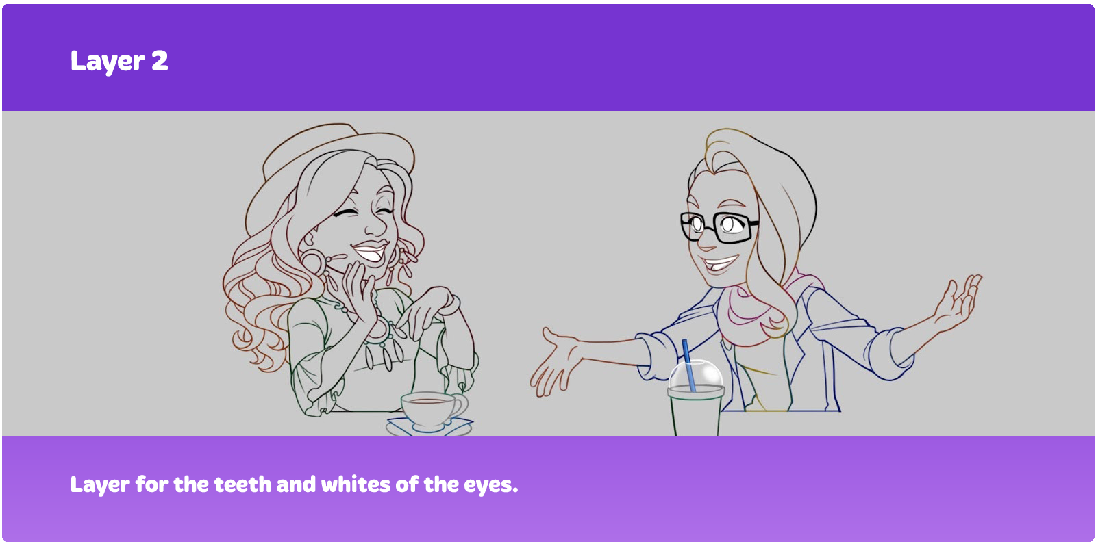
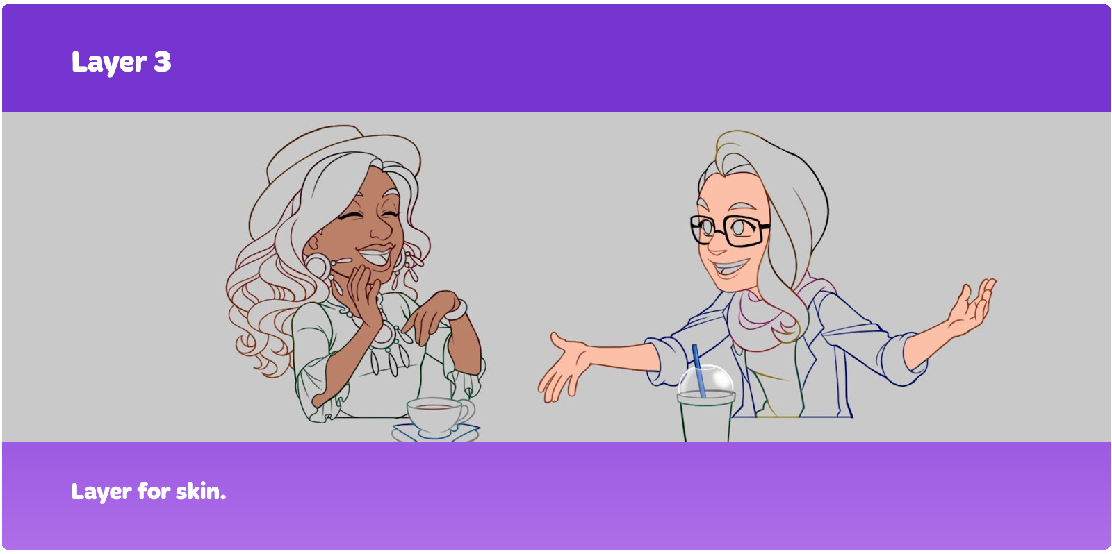
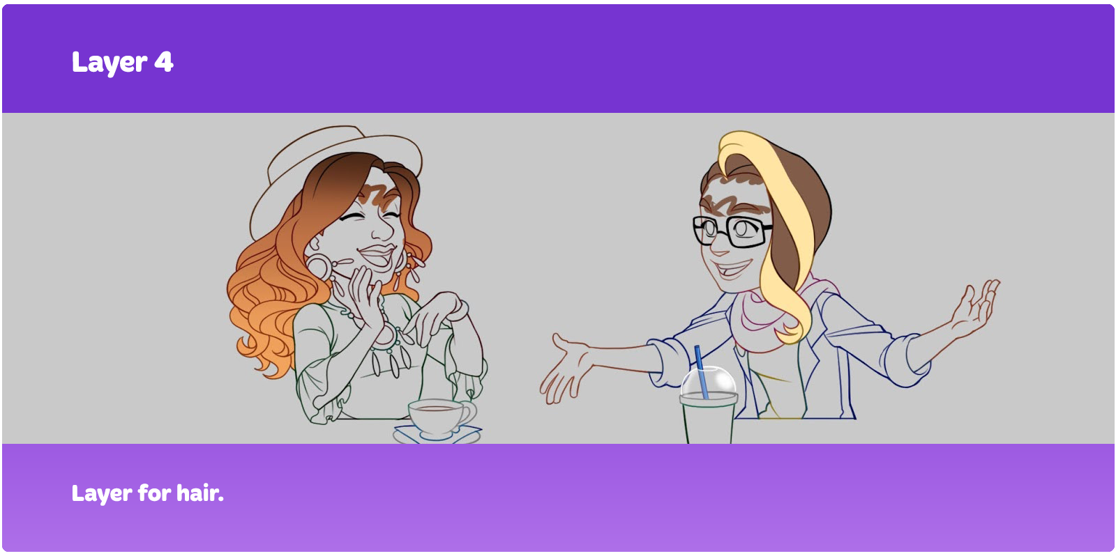
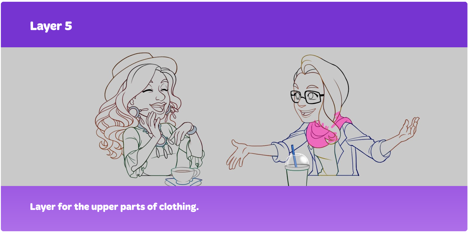
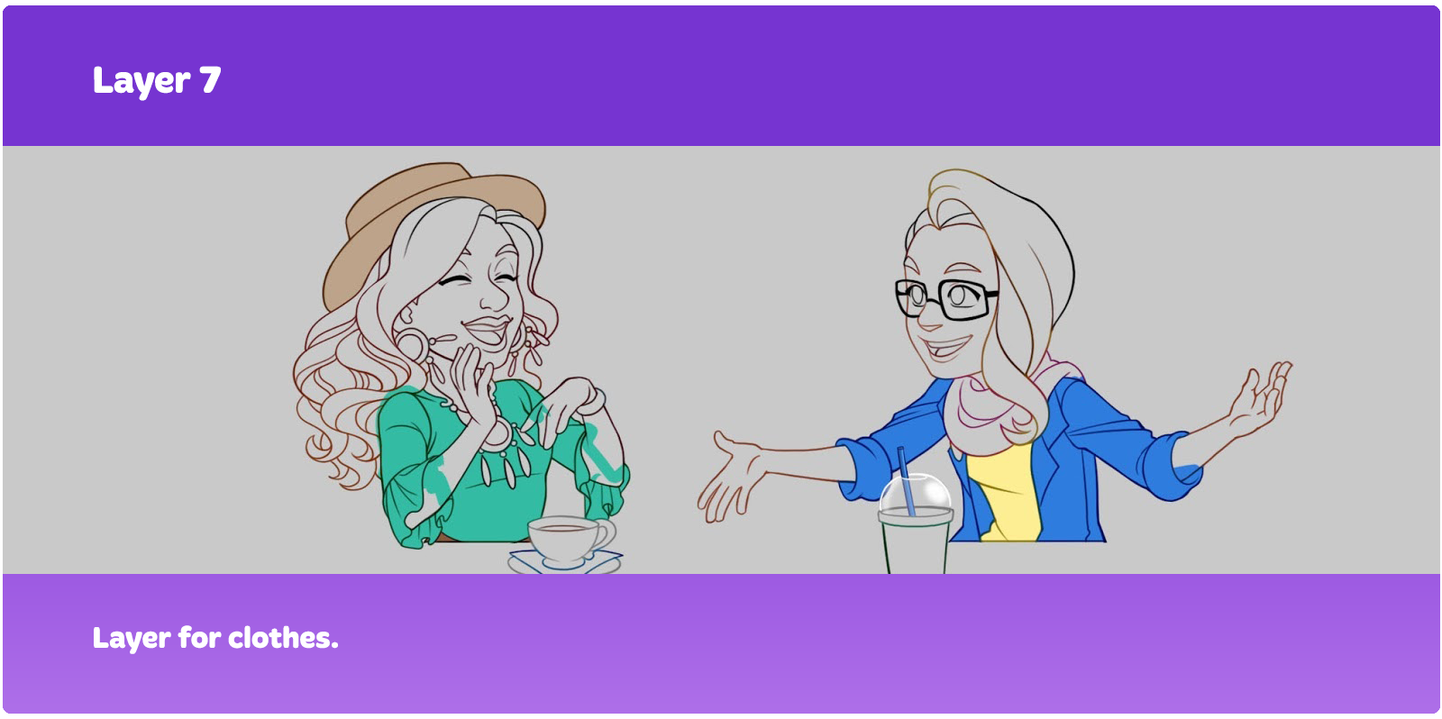
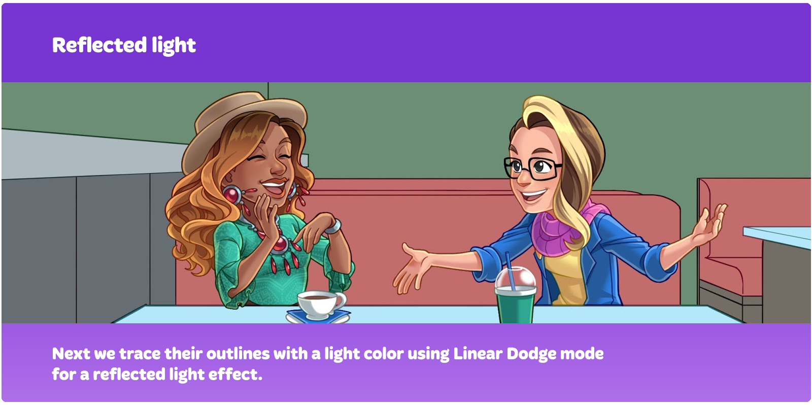
We render skin, hair, and facial features separately. For these important components of the character, in terms of color and saturation, we choose shadows carefully to make them look alive and colorful. We render clothes all together by setting layers to Multiply in order to speed up the process.
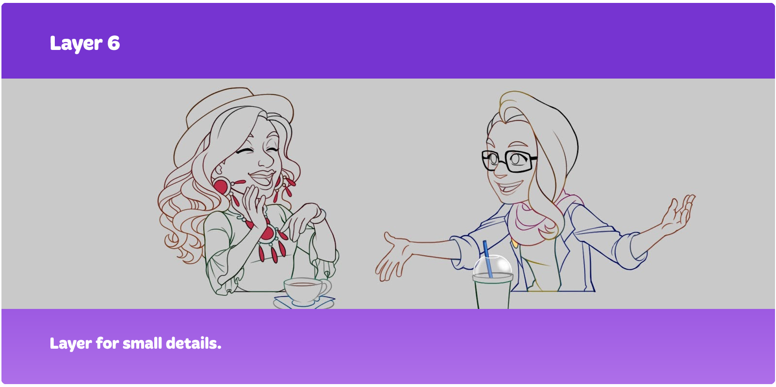
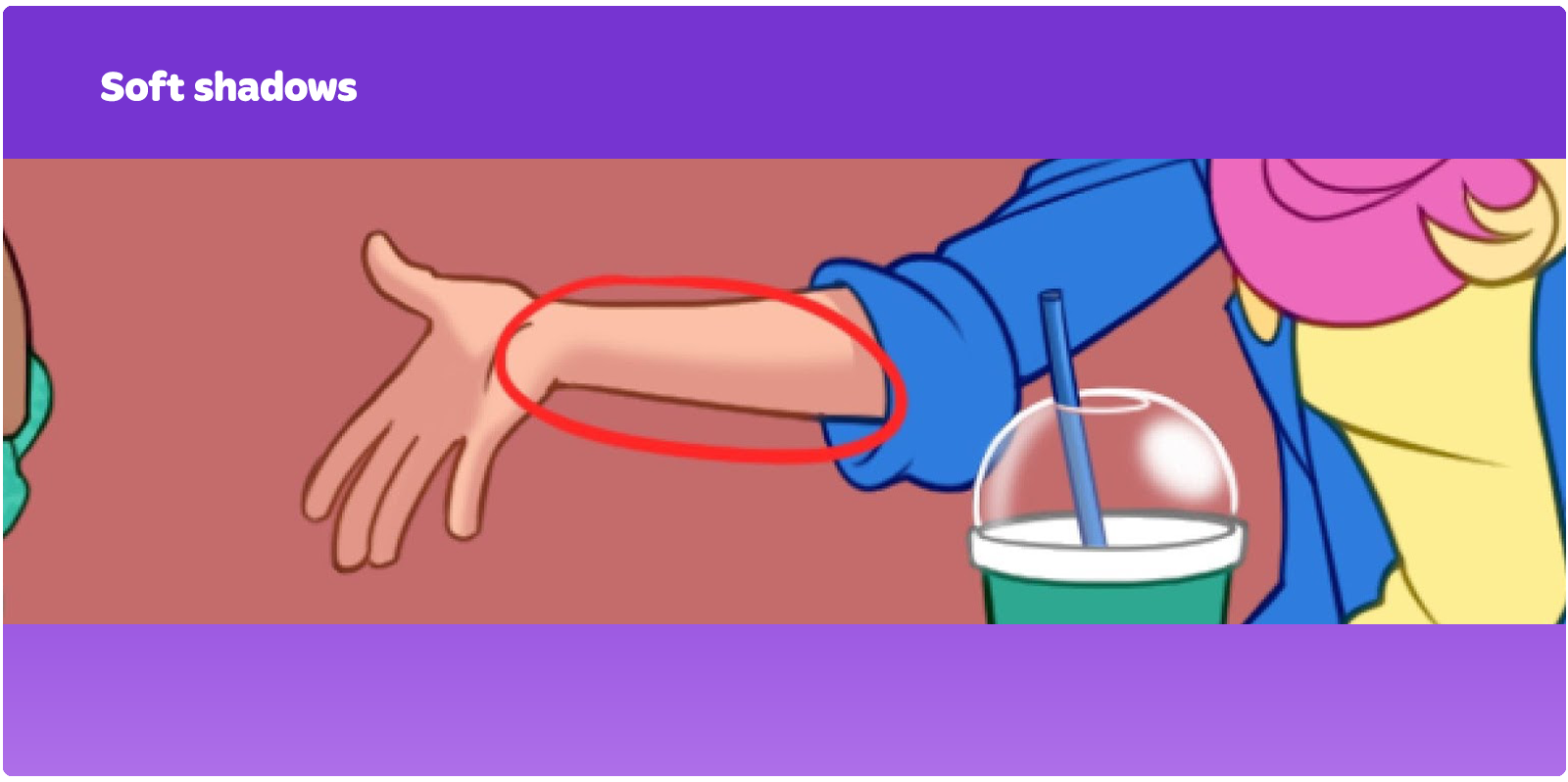
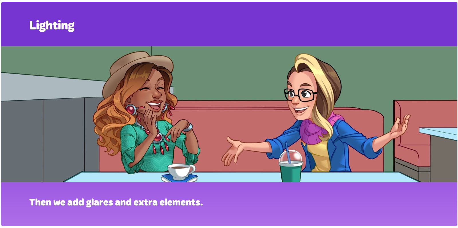
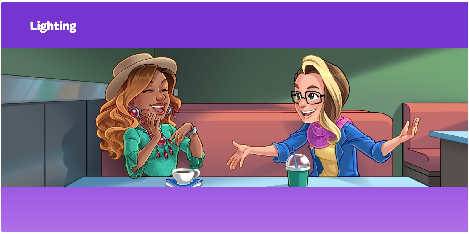
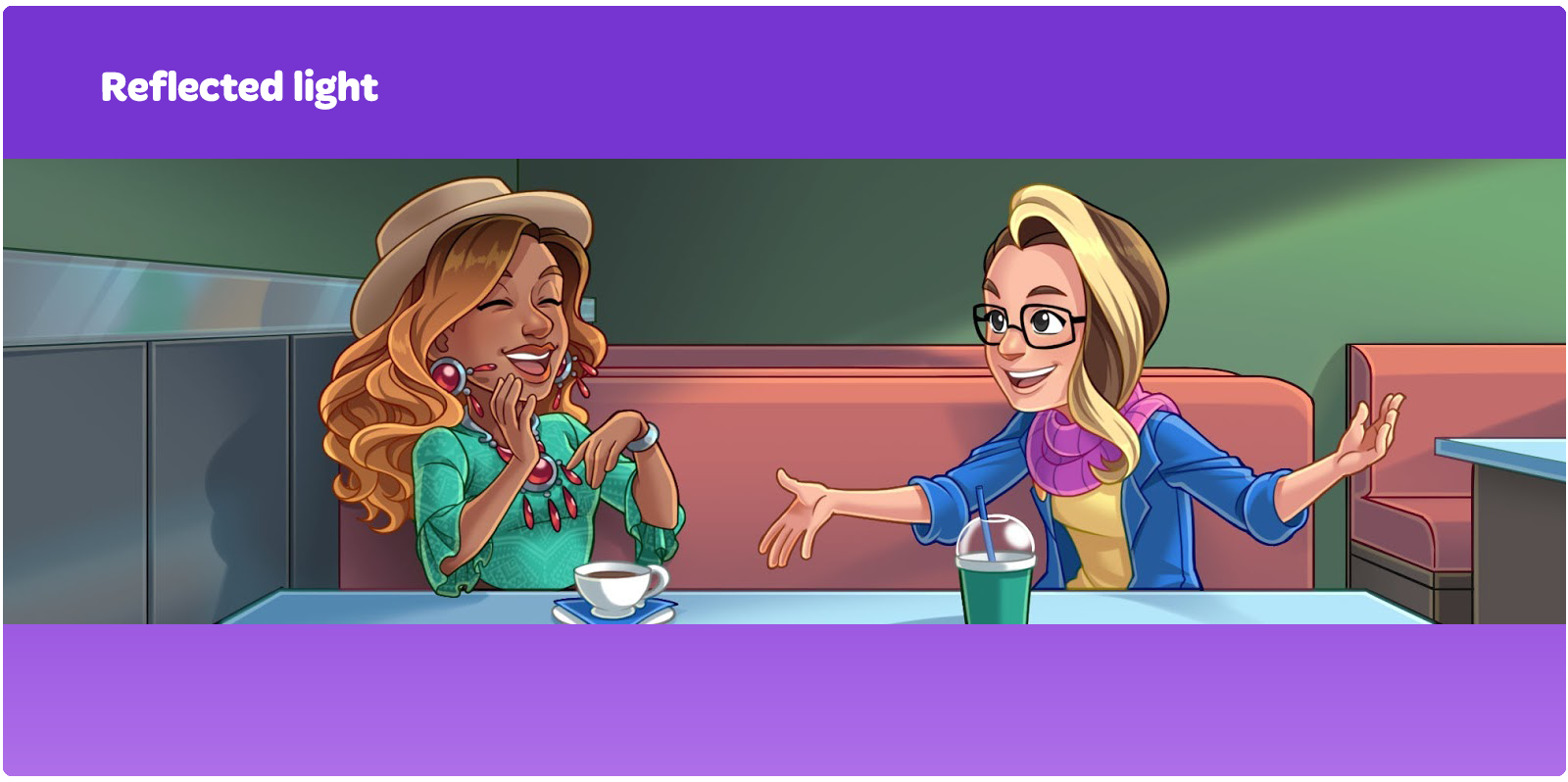
We use hard and soft shadows in rendering. Hard shadows are used in areas with sharp transitions of one plane to another and in areas where shadows are cast.
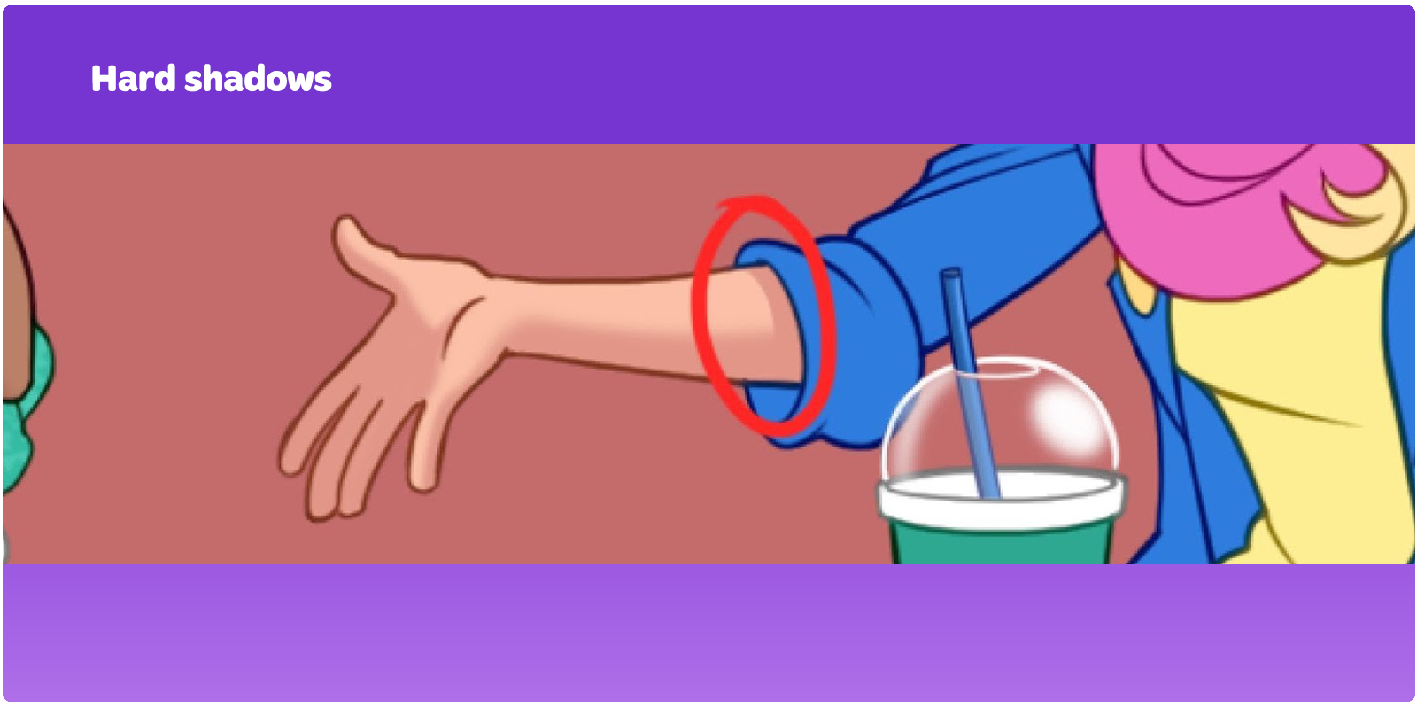
Soft shadows are suitable for smoother and more rounded transitions. The combination of hard and soft shadows makes the drawing more natural, even when it's stylized.
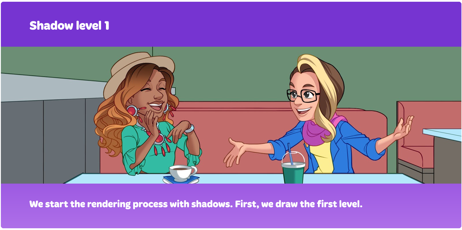
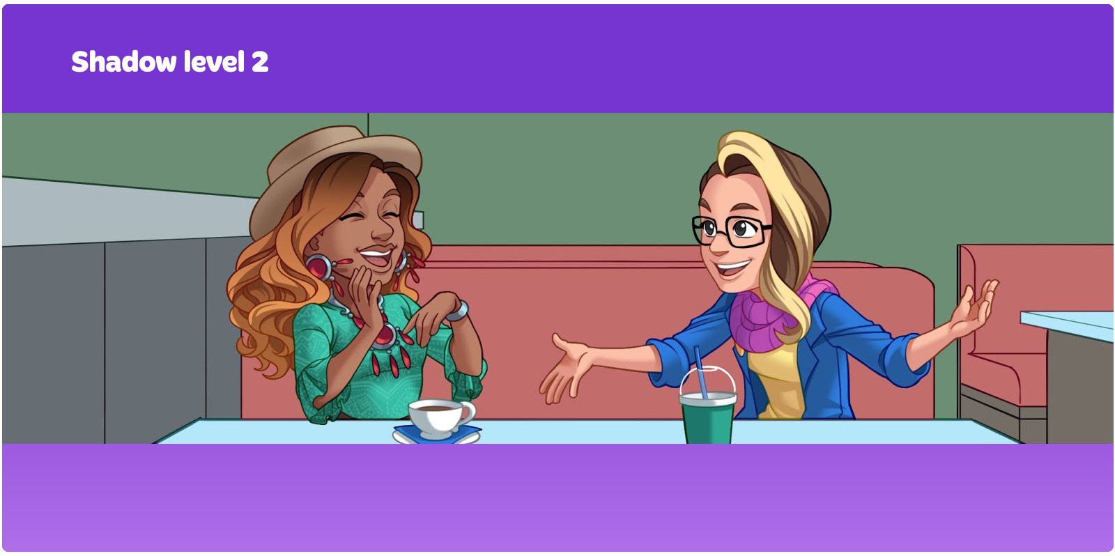
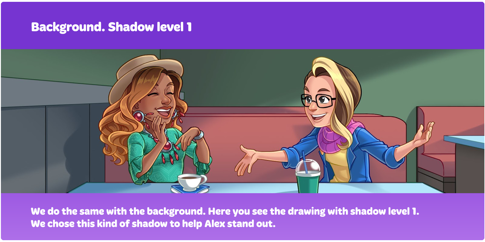
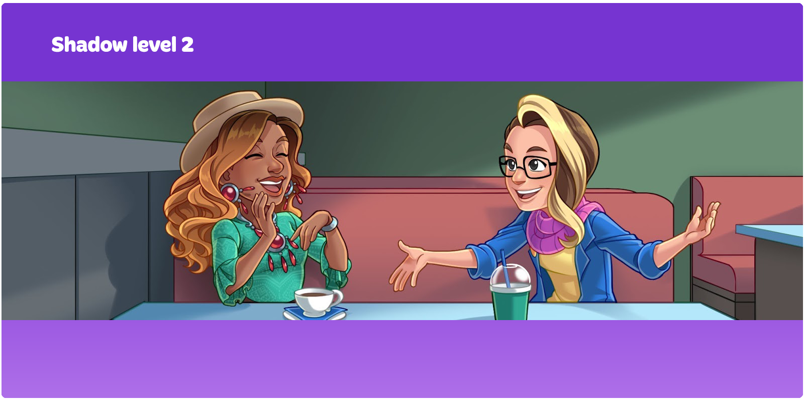
We start the rendering process with shadows. First, we draw the first level.
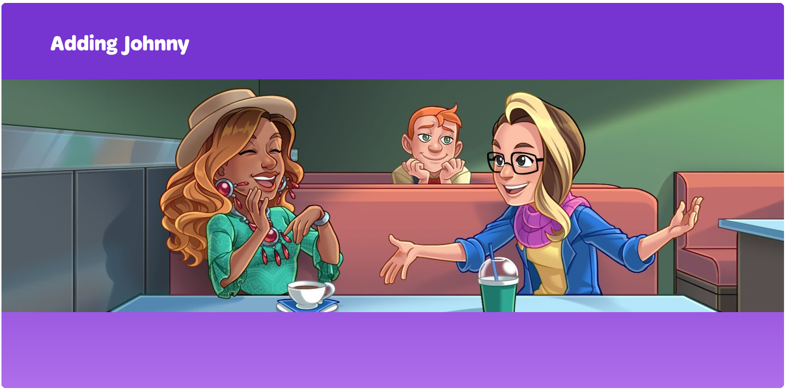
And, finally, we added Johnny. His layers were merged into one, which is why we are showing him in the end.
This is how we create narrative illustrations for Cooking Diary, from sketch to render. We hope you found it interesting and handy :)
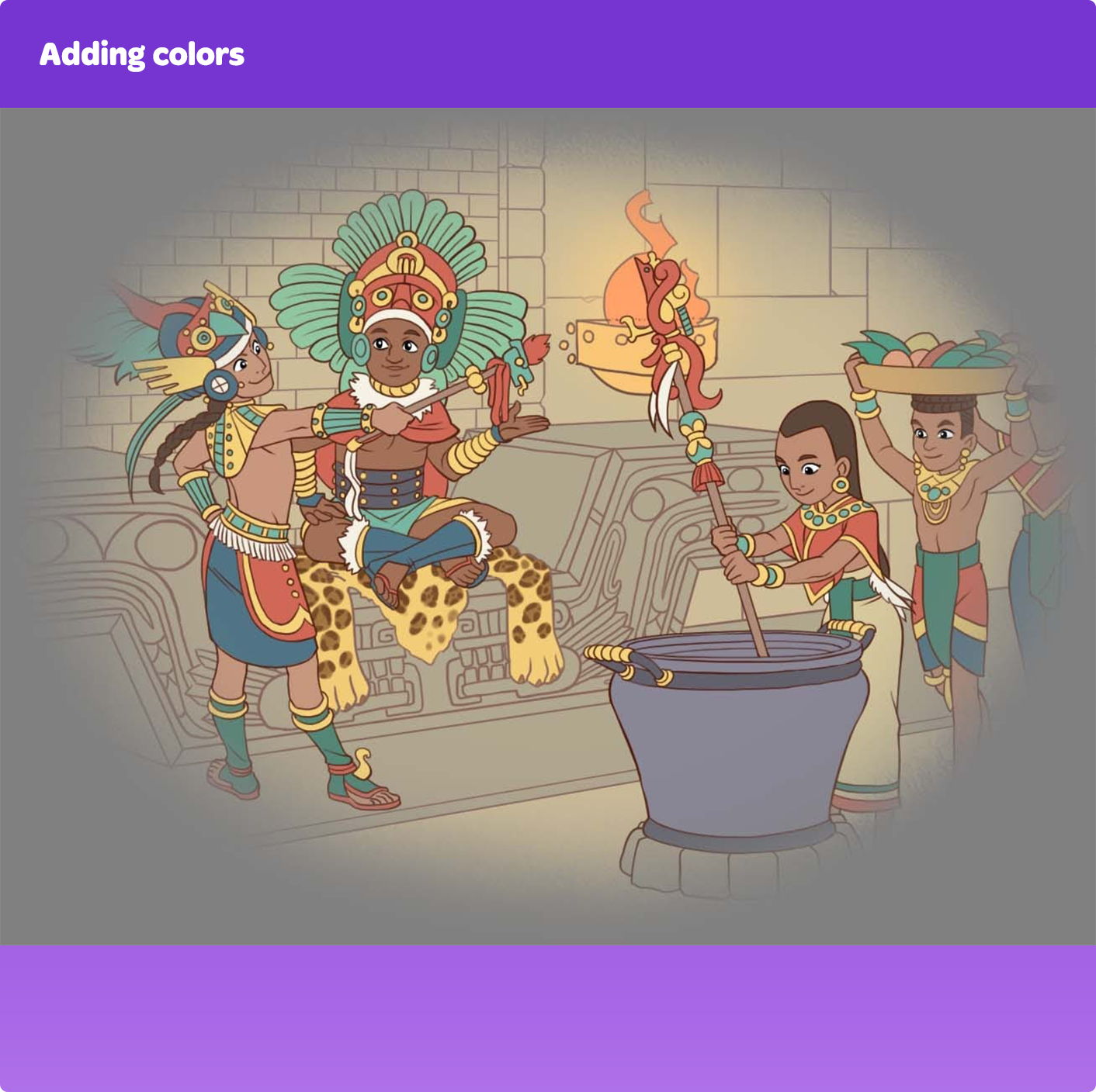
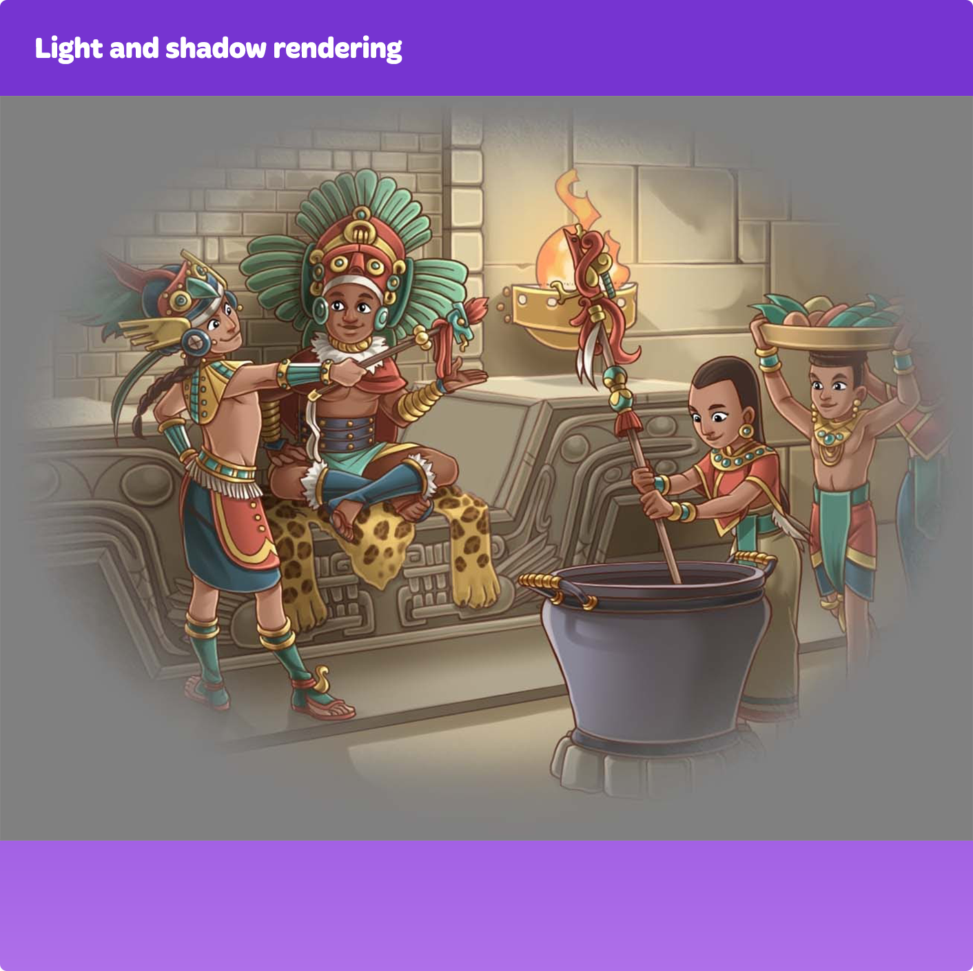
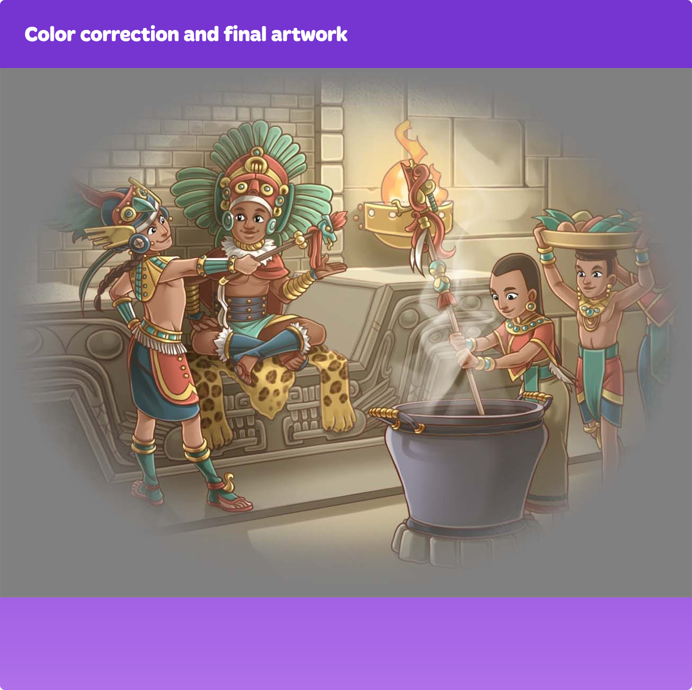
Here is an extra example of how we create narrative art.
Thanks to attention to detail, effective communication with writers, and the fact that our artists themselves are very eager to keep up with the story and each character, we have very vivid and interesting narrative art. We are happy that our players love both the gameplay and following the storyline, and that they look forward to new episodes to learn what happens next in the story of Tasty Hills.
Would you like to join the team and create colorful art for Cooking Diary? Send your resume and portfolio right under the vacancy you are interested in: https://mytona.com/career.